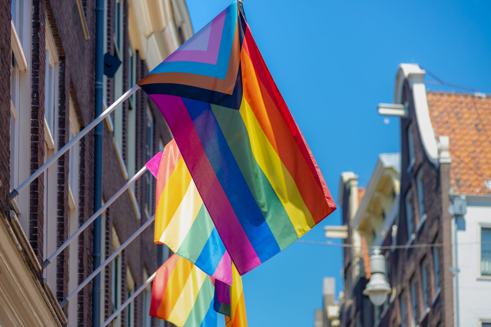
A New Era of Pride: The Journey from the Traditional to the Progress Pride Flag
·

·
TO112 is Queer-Owned. We take immense pride in being a queer-owned brand that supports and uplifts the LGBTQ2I+ community. Our diverse community of supporters has played a crucial role in our journey, and we are eternally grateful for their love and encouragement. In this article, we want to celebrate the updated Pride flag and delve into the significance of its colors, which represent the beautiful spectrum of our community.
The new Pride flag, often referred to as the "Progress Pride Flag," was designed by Daniel Quasar in 2018. It incorporates the traditional six-color rainbow flag with additional colors to represent marginalized LGBTQ2I+ communities, including people of color and transgender individuals. Let's explore the meaning behind each color in this inclusive symbol of unity and love.
What do the rainbow colors of the Pride flag mean?

The original Pride flag, created by Gilbert Baker in 1978, consists of six colors, each representing a different aspect of the LGBTQ2I+ community:
Red symbolizes life and vitality, reminding us of the energy and passion that drives our community.
Orange represents healing, highlighting the importance of overcoming past traumas and moving forward together.
Yellow signifies sunlight, illuminating our community's resilience and ability to shine even in the darkest times.
Green stands for nature, celebrating the diverse and organic spectrum of human sexuality and gender identity.
Blue embodies serenity, reflecting the peace and harmony we strive for within our community and with the world around us.
Purple (or violet) denotes spirit, honoring the courage and strength that define the LGBTQ2I+ community's fight for equality and acceptance.
The New Additions: Black, Brown, Pink, Baby Blue, and White

The Progress Pride Flag includes five additional colors to emphasize the importance of intersectionality and inclusivity within the LGBTQ2I+ community:
Black and Brown represent LGBTQ2I+ people of color, acknowledging their unique experiences and the need for representation and support within our community.
Pink, Baby Blue, and White are the colors of the transgender pride flag, designed by Monica Helms in 1999. These colors symbolize the transgender community, with pink representing trans women, baby blue representing trans men, and white symbolizing non-binary individuals and those who identify outside of the gender binary.
The incorporation of these colors in the Progress Pride flag sends a powerful message of unity and solidarity. It recognizes the intersectionality of our community and the importance of uplifting every individual's voice.
At TO112, we are proud to embrace the Progress Pride flag as a symbol of our commitment to inclusivity and support for all members of the LGBTQ2I+ community. We will continue to celebrate the diverse spectrum of identities and experiences that make our community so vibrant and resilient. Thank you for being a part of our journey and for standing with us in the pursuit of love, equality, and acceptance for all.


